
5 Interior Paint Colors Trending for 2026 To Create A Stunning Space

Photo from Behr
Is 2026 the year for a dark green dining room?
Every year, global color experts gather to study trends in art, culture, fashion, media, design, and even technology.
Their goal? To choose a color—or palette—that captures the current mood and mindset of society.
Some years, the picks are wildly popular. Other times? Not so much (looking at you, Millennial Gray). But love them or hate them, these shades often reflect what we’re all collectively craving in our spaces.
Now, do you need to repaint your whole house every time a new color drops? Absolutely not.
But if you’ve been itching to refresh a space or finally add some personality to a neutral room, a good place to start is with the color of the year.
This year we’re seeing rich jewel tones like deep greens, inky blues, earthy browns and softer, nature-inspired hues like warm whites and sandy neutrals. No matter your style, there’s something to love.
Let’s get into the top 5 colors we’re excited to see everywhere in 2026.
If you’re ready to give your home a paint refresh, we’re here to help!
5 Interior Paint Color Trends For A Stunning Home in 2026
1. Earthy Embrace: Brown is Taking Center Stage
Move over, cool grays, warm neutrals are stepping into the spotlight for 2026. Think rich taupes, sun-washed beiges, and soft terracottas that bring an earthy, lived-in feel to any space.
These aren’t your builder-grade browns from the early 2000s. Today’s warm neutrals are elevated, modern, and full of depth, making them perfect for timeless looks that aren’t boring.
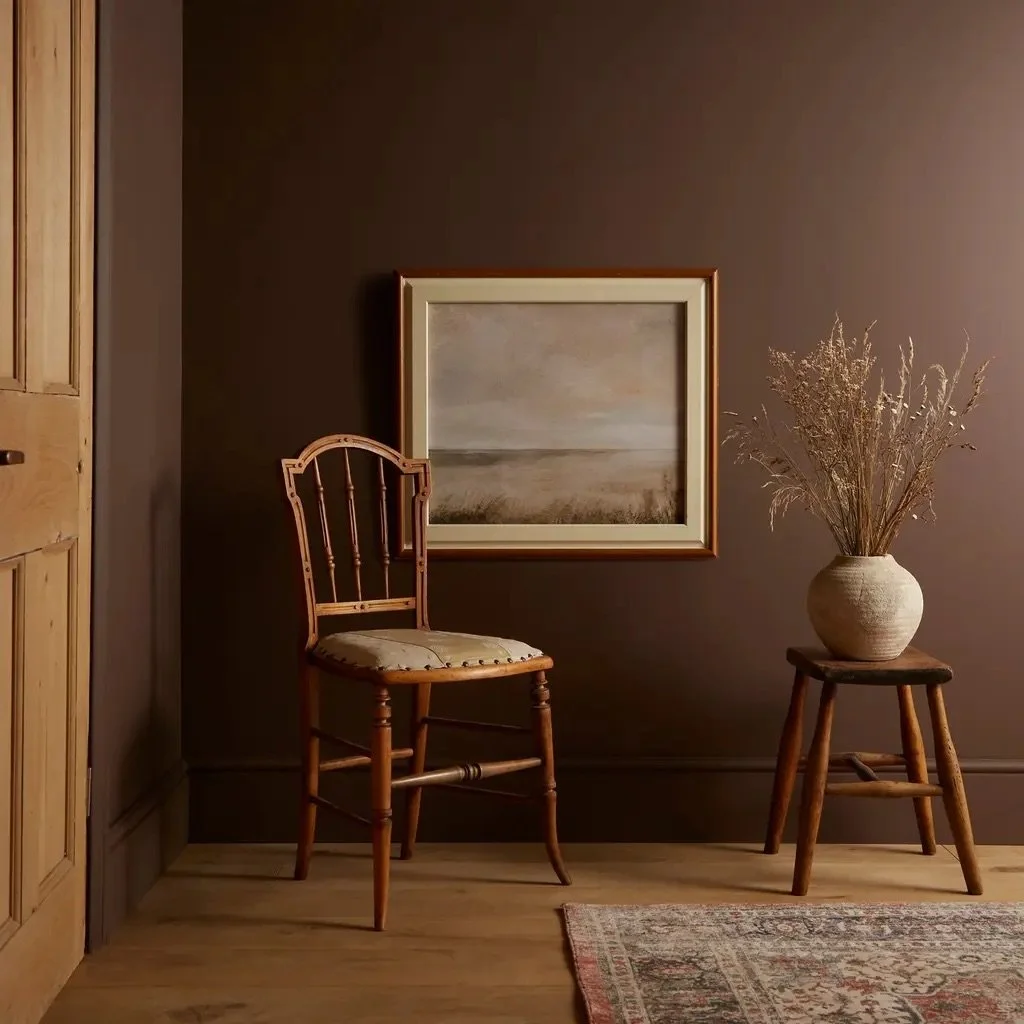
photo from Graham & Brown
Brown Paint color examples:
Benjamin Moore, Leather Saddle Brown, 2110-20 (a rich brown)
Graham & Brown, Elderton (pictured above)
Benjamin Moore, Cinnamon Slate, 2113-40 (a plum-brown)
What’s so great about brown?
It helps to create a cozy, organic, or rustic-modern vibe.
It’s a great elevated neutral for those worried about anything too bold.
Helps to warm up a space without making it too dark.
Where to add these warm neutrals:
Living rooms and bedrooms for a calm, cozy feel
Entryways to set a warm tone
Bathrooms paired with brass or wood accents
Even kitchens for a soft, earthy modern farmhouse look
Pro Tip: Use brown to create a cozy, grounded backdrop, especially when paired with light textiles, natural wood tones, or soft metallic accents.
2. Serene Sanctuary: Calming Greens and Blues
Bring the tranquility of the outdoors in with soothing shades of green and blue. While all shades are welcome, 2026 is leaning towards rich greens, navy blues, and light coastal blues.
These peaceful hues create a calming, restorative energy that makes your home feel like the sanctuary it is.
These shades feel effortless and easy to live with while still adding personality to a space.
Photo from Benjamin Moore
Green & blue color examples:
Sherwin Williams, Rain Cloud, SW 9639 (a dark, neutral blue like a stormy sky)
Dutch Boy Paints, Mapped Blue, 429-5DB (a cool grey-blue)
Benjamin Moore, Rosepine, BW 461 (pictured above)
Behr, Frosted Jade, PPU11-13 (a soft green-gray)
Sherwin Williams, Quietude, SW6212 (a neutral gray-green)
What’s so great about blue and green tones?
Any shade of blue and green helps to make any space feel instantly calmer.
They pair well with soft, nature-inspired palettes.
They help bring an air of peace and bring nature inside a little bit more.
Where to use these colors:
Bedrooms for a soft, restful vibe
Bathrooms for a spa-inspired look
Home offices for calm productivity
Nurseries or kids’ rooms for gentle color without overwhelming the space
Pro Tip: Mix different tones of green and blue for a fun, layered, sophisticated, and organic look.
3. Bold Statements: Jewel Tones Reign Supreme
Not quite minimalism, not quite maximalism, jewel tones are made for those who want their space to feel bold, expressive, and full of personality. In 2026, rich, saturated hues are taking center stage in a big way.
Think emerald green, sapphire blue, ruby red, and amethyst purple.
These shades are moody, luxurious, and endlessly versatile. They’re perfect for making a space feel elevated without being stuffy.
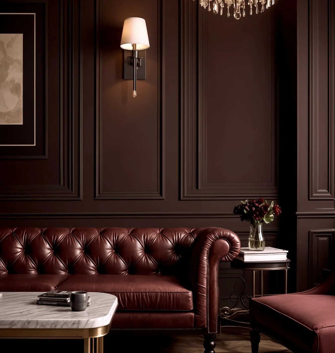
Photo from C2 Paint
Jewel tone paint colors:
C2 Paint, Raku, C2-549 (pictured above)
BEHR, Rumors MQ1-15 (a deep ruby red brick, think kitchens from the 90s)
Sherwin Williams, Bosc Pear, SW 6390 (a rich, deep golden)
Sherwin Williams, Cascades, SW 7623 (a dark, stormy blue)
What’s so great about jewel tones?
They’re great ways to add color and break up the beige.
Perfect for those who want something different.
They can easily create the feeling of a high-end & curated.
While also creating a cozy, dramatic mood.
Where to use them:
Accent walls in living rooms or dining rooms
Offices, studies, and reading nooks for a luxe feel
Powder rooms for unexpected wow-factor
Cabinetry or built-ins for a bold, high-end touch
Pro Tip: Pair jewel tones with natural wood, soft neutrals, or minimalist decor to balance richness with restraint. Jewel tones can also create a warm and inviting commercial space.
Explore our commercial painting services to see how we bring color into workspaces.
4. Fresh and Playful: Soft Whites
Soft whites are having a major moment in 2026. And no, we’re not talking about cold, sterile shades. Today’s whites are warm, creamy, and full of depth, making them the perfect choice for creating a calming, elevated space.
These tones work beautifully on their own or as a quiet backdrop to bolder accents. They bring light into a room without feeling stark, and they pair effortlessly with both warm wood tones and cool metals.
Photo from Dunn & Edwards
Soft white color examples:
Sherwin Williams, White Snow, SW9541 (a creamy white)
Behr, Rock Crystal, MQ3-28 (a light gray with tones of lilac)
Dunn-Edwards, White Picket Fence, DET648 (a crisp white with slightly warm undertones, pictured above)
What’s great about soft whites?
Provide a fresh, updated look without dramatic color
They pair well with any style but are especially great for fans of Scandinavian, organic modern, or minimalist design styles
If you’re working with a small space, soft whites can make rooms feel brighter and bigger
Where to use them:
Living rooms and bedrooms for a soft glow
Kitchens and bathrooms to reflect natural light
Hallways and entryways to keep things feeling open and bright
Pro Tip: Layer different white tones on walls, trim, and ceilings for a sophisticated, tone-on-tone look that feels intentional, not flat.
5. Nature's Palette: Organic and Earthy Hues
Inspired by natural landscapes, global travels, and artisan materials, these earthy hues are all about bringing the outside world into your home.
In 2026, colors like olive green, burnt orange, mustard yellow, and pinky neutrals like Little Greene’s Mochi are showing up everywhere—from walls to cabinets to accent decor.
These shades feel collected, curated, and lived-in. They're perfect for anyone wanting their spaces to reflect personal style, a love for travel, or a deeper connection to the natural world.

Photo by Little Green Paint & Paper
Organic color examples:
Little Green, Mochi, 344 (a softer pink-brown, pictured above)
Benjamin Moore, Tissue Pink, BM 1163 (a glowy blush)
Sherwin Williams, Olive Grove, SW7734 (a neutral brown-green)
What’s great about earthy hues?
Bring a worldly or boho feel to any room
Create a warm, grounded space over sleek or stark ones
Allow you to experiment with sun-warmed neutral tones without going full beige neutral.
Where to use them:
Dining rooms for a bold, grounded statement
Bedrooms or living rooms paired with natural wood and soft textiles
Entryways to create an inviting, earthy first impression
Pro Tip: Pair these earthy hues with natural textures like wood, rattan, linen, or handwoven textiles. Layer in global patterns or handmade ceramics to make the space feel curated and full of soul.
Try One of These Interior Paint Colors
Whether you're planning a full-home update or just tackling one room, our interior, exterior, and commercial painting services can help you bring these 2026 color trends to life. From choosing the right shade to getting the perfect finish, our team can guide you through every step of the process.
Get a free estimate from our team.
FAQs About Interior Paint Colors
How do I choose the right paint color for my room?
Start by considering the room’s lighting, size, and purpose. Test samples on your walls and observe them throughout the day, since natural and artificial light can dramatically change how a color appears.
Does lighting affect how paint colors look?
Yes, lighting plays a huge role in how paint colors appear. Natural light brings out the truest color, while warm artificial lighting can make colors look more yellow or cozy, and cool lighting can make them appear slightly blue or muted.
Should I use the same paint color throughout my home?
Using a consistent color palette can create a cohesive flow, especially in open-concept spaces. However, you can still introduce variety by using complementary shades or accent walls in different rooms.
What paint colors are best for resale value?
Neutral, widely appealing colors tend to attract more buyers. Soft whites, warm grays, and light beige tones create a clean, move-in-ready feel that allows potential buyers to envision their own style in the space.
How many paint colors should I use in one room?
A good rule of thumb is to stick to 2–3 complementary colors. This keeps the space visually interesting without feeling chaotic or overwhelming.
How do I test paint colors before committing?
Use peel-and-stick samples or small test patches on your walls. Check how the color looks at different times of day and alongside your furniture, flooring, and décor before making a final decision.